Chapter 2 Data Analysis: Base R
2.1 Session 01: Visualization
2.1.1 Correlation Plot
2.1.2 Pie Chart
pie(
     c(280, 180, 130),
     c('Sky', 'Sunny', 'Shady side'),
     col = c('#0292D8', '#F7EA39', '#C4B632'),
     init.angle = 130, border = NA,
     main = "A Sample Pie Chart")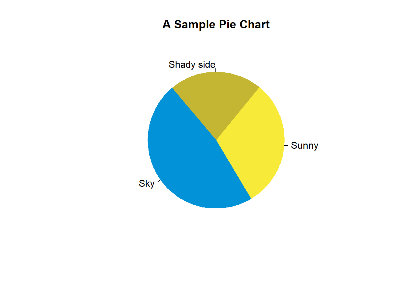
2.1.3 Bar Chart
2.1.4 Chart Characteristics (color, title, axes etc.)
2.1.5 How to Use Proper Legends?
2.1.6 Histogram
2.1.7 Ogive (and how to interpret it)
2.1.8 Boxplot
2.1.9 Time Series Plots/Line Chart
2.1.10 Scatter Plot
2.1.11 Equation and Curves
2.1.12 Love Equation and Curve
2.1.13 Different Ways of Coloring Plots
2.1.13.1 RColorBrewer
2.1.14 Wordcloud
2.1.15 Comparison of Suitability of Plots.
2.2 Session 02: Analysis
Measures of Central Tendency and Dispersion (Averages, Quartiles, Variance, etc.); Correlation;